Design

Emotional Map Design - Experience iTunes

 Experience to study: purchasing an album on iTunes.

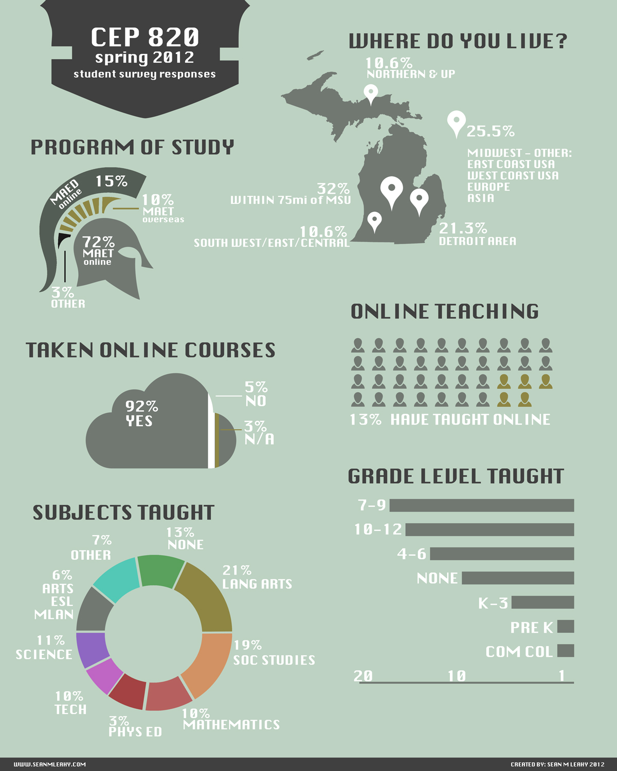
Emotional Map – a visual representation of the user experience of purchasing an album through Apple’s iTunes music store.  The Map can be read by using the vertical line to represent the main timeline of the process, with the horizontal text on the left indicating the individual steps in the process.  The lettered notes are indicated within each step, then mapped in color that ranges from negative (blue) emotion to positive (red) emotional experience.

emotionmap-SML
emotionmap-SML

Latent opportunities are ubiquitous: Pick an environment For this emotional experience I have established that I will study my own emotional experience of purchasing a digital music album online.

Who or what to study: For this study I will map my emotional experience of purchasing a music album from Apple iTunes from my laptop computer.

Establish a goal: My goal for this study is to identify areas of my experience that could be improved upon based on my emotional response to the various aspects of the experience.

Establishing modes and identifying touch-points:Modes:

  • Anticipation: Anticipation is the first mode, where the user reflects on the idea of purchasing a new album from iTunes.  Reflecting on previous experiences of purchasing music through iTunes from various devices, and any feelings of excitement or trepidation that may shape how the interaction is approached.
  • Launch (Enter): This is the second step where the user actually opens iTunes Store and gains access to the library of music, videos, podcasts, and other media available for purchase.
  • Engage: This being the third step, is where most of the interaction takes place.  This step is where the user interacts with the various components of the iTunes store and contain the majority of the touch-points of the purchasing process.
  • Exit: This is the step in which you have completed the transaction and leave the iTunes Store environment after your purchase is completed.
  • Reflection: The final stage in which you reflect upon the recent experience of purchasing an album through iTunes and how it compares to the anticipation stage from which previous experiences were used to foreshadow how the current experience would go.

Touch-points:

  1. Online: (Anticipation)
    1. browsing music online searching for something new.
    2. Finding a new band/song that is catchy and new.
    3. Looking them up to see what other works they have, and band info.
    4. Launching iTunes (Anticipation)
      1. Hoping that the artists album will be available.
      2. Looking forward to seeing if iTunes has other similar matches that would be new “discoveries”.
      3. Opening iTunes Store: (Launch/Enter)
        1. Waiting for store homepage to load.
        2. Notice the new items promoted on the homepage.
        3. Enjoying the design layout of the iTunes store.
        4. Noticing the clear separation of categorical items (music, movies, tv shows, apps, books).
        5. View Top Rated Charts (Engage)
          1. Notice the “young” music at the top.
          2. Surprised by what is downloaded most.
          3. Click on few songs that are unfamiliar by artist/name.
          4. Search for specific artist (Engage)
            1. Type in search field artist name
            2. Waiting for iTunes search to be completed
            3. notice the variety of search results showing multiple albums/tracks
            4. browse options based on price
            5. encouraged by filter options that appear on left hand side
            6. Select Album (Engage)
              1. Click on album of interest (latest release)
              2. see list of songs and associated popularity (rating)
              3. preview songs (30 sec) - go through all
              4. read band info
              5. frustrated there are no reviews
              6. evaluate if there are more than one song that is good
              7. Purchase Album (Engage)
                1. Hover over “Buy Album” button to consider the value of the album based on song preview and album price.
                2. Click “Buy Album” button
                3. Please there is no further “checkout process”
                4. Wait for Download (Exit)
                  1. Downloads fast pleasing that it doesn’t take much time.
                  2. impatient for entire album to finish.
                  3. Play Music (Reflection)
                    1. play entire album and listen to each song.
                    2. burn to CD for backup
                    3. Load music on mobile devices (Reflection)
                      1. load entire album on iPhone and iPad.
                      2. Listen to as travel music on daily commute.

This project was inspired by the Experience Map created by Erik Berkman from Little Spring Designs on improving the Starbucks experience.

Online Course Award - 2012 AT&T Awards

I am proud to announce that CEP 820: Teaching K12 Students Online (a full online course) has been recognized with an honorable mention for the MSU AT&T Award of Excellence. This course has seen a long history of iteration and revision. This course is a unique example of teaching K12 teachers how to teach online, through a fully online course.  Throughout the course, best practices, and innovative uses of technology were employed to serve as an exemplar online course in which all of the concepts and practices taught were demonstrated in the course environment.  To this aim, students in the course were able to experience principles of good design and gain first-hand experiences and reflect on the usage of various online teaching tools.

See the full AT&T Awards site for more information -http://attawards.msu.edu/winners/2012/cep-820

Additional details on the course can be found in the Awards Application, submitted by Dr. Leigh Wolf.

Creating Infographics for research data

CEP-820-Survey-Infographic

Infographics have become a popular new trend on consuming data in a more elegant fashion than the boring tables and charts of the past.  So this year when I was working on sharing the student data collected for an online course (CEP 820) I am teaching this spring semester, I wanted to branch out into the art of infographics to share this information with students.

Every semester the students in CEP 820 fill out an introductory survey as the first order of business for the course.  CEP 820 is a course offered to master level students in Masters in Educational Technology program (MAET) or Masters in Education program (MAED) at Michigan State University.  CEP 820 has a course title of Teaching Students Online, and is focused around the concepts, theory and practice of developing online courses and modules for a variety of educational needs.  This survey is used to help this fully online class get a better perspective of the makeup of the study body.

This year I wanted to do something a little more contemporary with the data.  In the past the students are usually presented with a few graphs and statistics about the composition of the course.  For this year I decided to go a little out of the way and create an infographic poster.  My intent to create this poster was two fold.  First, I wanted something more contemporary and fun for the students to see and explore the data with.  Second, I wanted to create something that can easily be repurposed by any of the students or instructors of this course (eg paper/conference presentations, web portfolios, etc.).

Creating this infographic was very fun.  It allows the artist to represent data in a much more compelling way than just presenting the data as a standard chart.  Now, I'm not advocating that standard charts or data tables ever go away, it's just nice to have an informative poster in addition that can serve as a great entryway to get people interested in the data behind research.

I look forward to developing more infographics on some research that is currently ongoing.

Custom Tee's and posters - MAET Style

MAET-PosterSread1.jpg

For the 2011 summer MAET program I decided to create a custom look and feel for the course related material.  Since this program is so unique I decided to create a new look or "brand" for the course this past summer.  I wanted to create something that was both contemporary (in terms of design) but also representative of the educational technology focus of the program.  My original design inspiration came from the design group Build and their designs for the documentary film Urbanized.  

For the main focus I wanted to focus on the text of "Educate" since that verb is just what is happening, the students in the program are being educated, but the students themselves are the best possible educational technology advocates who take what they have learned and further educate their colleagues and students.   Secondly, since there are 3 years of the program, I wanted to create a unique design for each year trying to pull together a visual representation that was special to that year.  The posters are 16 x 24 inches at 300dpi.

Year 1: Grey Poster

This poster emphasizes the initial integration of what the Masters of Arts in Educational Technology is all about.

Year 2: Red Poster

For year 2 I wanted something slightly more "busy" as the level of technology integration increases as students start exploring and researching the integration of technology, pedagogy, and content knowledge (TPACK).

Year 3: Green Poster

Year 3 is a wonderful capstone to the program in which students are pushed to explore and experience many technology tools and platforms for which they can use in their own professions.  The students in year 3 will be exposed to a wide range of technologies from image editing, website development, audio and video production.

Why QR codes?

A common theme throughout the the posters in addition to the main textual theme of "Educate" is the integration of QR codes in each of the posters.  The QR codes were used to continue the theme of educational technology by enhancing the posters themselves which are printed on paper, as still being interactive when scanned with a smart phone or other device that can read QR codes, allowing me to keep the design fairly simple while still being able to provide the necessary information.

Finished Product:

The Posters came out great, the only small issue I had was with the green poster.  I could not find a print shop that could go as neon of a green as I had designed so I ended up settling for what they had.

Tee Shirt:

As an added element to the summer design, we decided to create a tee shirt based on the year 3 (green) poster.  Since the decision to make the shirts came late in the game, I only had time to get enough printed for the staff of the summer program.  I had a small run of 20 shirts run from the great folks at RetroDuck.com   The shirts were a hit, and you can be sure that next summer everyone will have a chance to order one.