
NEWS & UPDATES

Made by Humans: The Apple TV Logo and Future of Design
Made by Humans: What the New Apple TV Logo Reveals About the Future of Design
In a world saturated with AI-generated media, branding, and motion graphics, it’s easy to assume every logo and animation comes from a prompt. But Apple’s new Apple TV logo and mnemonic quietly challenge that assumption—and offer a glimpse into a different future of design.
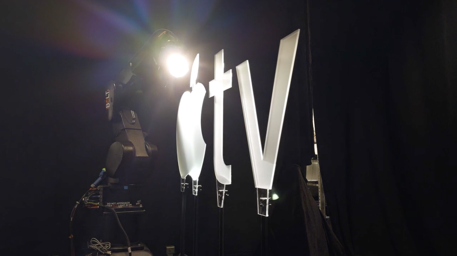
In a recent episode of the Modem Futura podcast, we unpack the surprising story behind this five-second sequence. Instead of relying entirely on CG or generative tools, Apple commissioned a physical frosted-glass Apple TV logo, mounted on a rig and filmed as colored light passes through it. The luminous flips you see on screen aren’t a simulation; they’re real light interacting with real material.
The audio is equally intentional. The signature Apple TV chime was composed by Finneas, distilling identity and emotion into just a couple of seconds of sound. Together, the visual and audio design embody a level of care, craftsmanship, and human judgment that stands out in today’s AI-heavy landscape.
On the episode, we explore why this matters for creators, educators, and anyone thinking about the future of being human. From Steve Jobs’ insistence on caring about the parts “no one sees” to new signals like “This show is made by humans” tags, we’re seeing a renewed appreciation for work where human intent is clearly present—even when the audience can’t articulate why it feels different.
Rather than rejecting AI outright, we argue for using it in ways that amplify human creativity without erasing the craft that gives our media meaning.
🎧 Listen to the full conversation on Modem Futura wherever you get your podcasts, and explore more at futureofbeinghuman.asu.edu.
Subscribe and Connect!
Subscribe to Modem Futura wherever you get your podcasts and connect with us on LinkedIn. Drop a comment, pose a question, or challenge an idea—because the future isn’t something we watch happen, it’s something we build together. The medium may still be the massage, but we all have a hand in shaping how it touches tomorrow.
🎧 Apple Podcast: https://apple.co/3JT2Tms
🎧 Spotify: https://open.spotify.com/episode/6mkbtUMk9P99BhxRA11aki?si=1d36zowmQb2eo7AFctk1rg
📺 YouTube: https://youtu.be/df-crZLZJuM
🌐 Website: https://www.modemfutura.com/

Apple TV’s New Logo and Mnemonic: Proof Craft and Care Matter in Modern Design

In a digital landscape overflowing with AI slop, synthetic users, and nonstop algorithmic noise, moments of genuine craft feel increasingly rare. Every now and then, though, something cuts through—something small, precise, and clearly built with care. For me, that respite lately has been Apple’s new Apple TV mnemonic: a simple animated logo with sound, but one that feels unmistakably crafted by human hands.
As many have noted, Apple quietly updated its Apple TV streaming brand by dropping the “+,” refreshing the color treatment, and unveiling a new animated mnemonic designed to anchor the brand before all video content. The audio component was created in collaboration with musician and producer Finneas (best known for his work with Billie Eilish), who spoke with Variety about shaping a sound that would instantly signal “Apple” in a fraction of a second.
So why does this tiny logo animation matter?
Because beneath its sleek surface lies a level of intentionality and craftsmanship that is increasingly uncommon. Apple has long embraced this ethic—one handed down directly from Steve Jobs, who often invoked his father’s lessons about finishing the back of the fence. The idea was simple: even if no one else sees it, you see it, and your work should reflect a complete commitment to quality. Jobs echoed this in a 1994 Wired interview:
““When you’re a carpenter making a beautiful chest of drawers, you’re not going to use a piece of plywood on the back… You’ll know it’s there. For you to sleep well at night, the aesthetic, the quality, has to be carried all the way through.””

Source: AdAge
The new Apple TV mnemonic embodies that ethos. Viewers see a sharp animation and a clean sonic signature—nothing unusual on the surface. What they don’t see is the painstaking creative work behind it. In a behind-the-scenes reel (via AdAge), Apple reveals that the animation wasn’t CGI or AI-generated. Instead, they filmed it as a practical effect: a physical glass logo turning under carefully orchestrated light, later composited to create the final result. Light refracting through real material—something still extraordinarily difficult to simulate convincingly—gives the piece a richness that no purely synthetic workflow could replicate. (Source: BTS video provided by AdAge)
And that’s the point.
In a moment when digital production pipelines are optimizing for speed, scale, and automation, Apple chose deliberateness. They chose craft. They chose to paint the back of the fence.
Every time the mnemonic appears before a show or film, it’s a brief reminder that care is a design value. That craft still matters. That human creativity leaves traces—subtle, often invisible—that shape how something feels, even if the average viewer never notices the details consciously.
It’s a tiny gesture, but an important one: proof that intention can still shine through the noise.
Well done, Apple!
I can’t wait to see what’s next.